The Brief
I was asked to design a new logo mark for a new fitness clothing company. They were looking to take their brand forward and create a logo mark which included the ‘B’ and ‘S’ of the company name, and would be eye-catching and iconic. The logo mark was to be designed to work on all mediums (online, social media, clothing & general print etc). The main purpose was to help develop the brand and move into producing their own clothing range. With this in mind, it had to be a strong logo mark and be able to shine when embroidered or printed on clothing. The added challenge was to create a logo mark that would work across social media platforms, which proved to be a main method of keeping customers informed of news and promotions. The key platforms proved to be Instagram, Facebook and Twitter. Therefore, the logo mark should stand out from the crowd in the marketplace.
The challenge
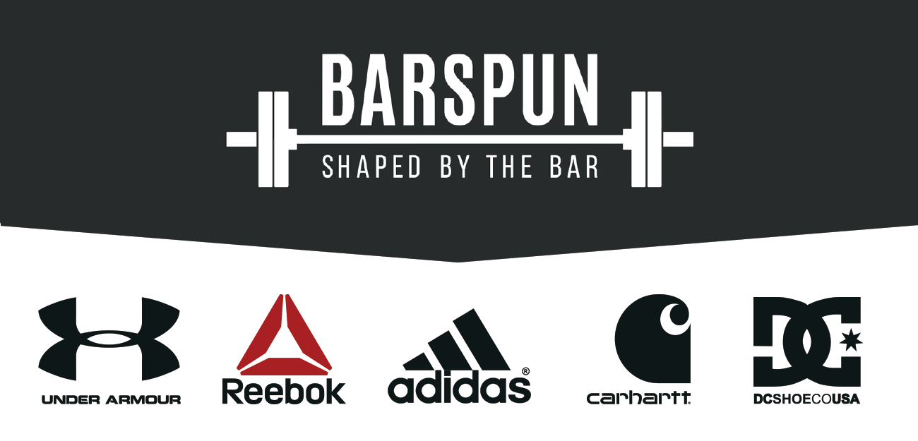
The client felt their current logo didn’t translate well to their growing business and requirements. Through meetings and research, it became apparent that creating a more compact and graphical logo mark would be best suited to their business. Their ambitions were for the brand to become iconic within the rapidly-growing cross-fit and weight-lifting communities.
Initial designs
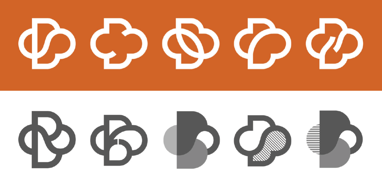
Based on researching the key demographic (males & females 18-40), healthy, image conscious, ‘trendy’ & with a good knowledge of social media, along with the vision of the brand and it’s values, I had enough information to begin creating some concepts. After sketching out a number of quick ideas, this combination of the ‘B’ and ‘S’ was decided on. As with any project, I always consult the client on every stage and provide plenty of ideas to help to focus on the best outcome… What would work best graphically? What would scale best? Could the logo be one continuous line or made up of elements? These were some the the questions to go through while creating the logo mark. Here are some examples of the exploration of the concept.
Colour palettes
The client was eager to adjust their Brand’s colour palette slightly… we decided to bring in a strong colour to go with the minimal black and white they had been using for some time. To help them decide, I created a number of logos based on different colours.
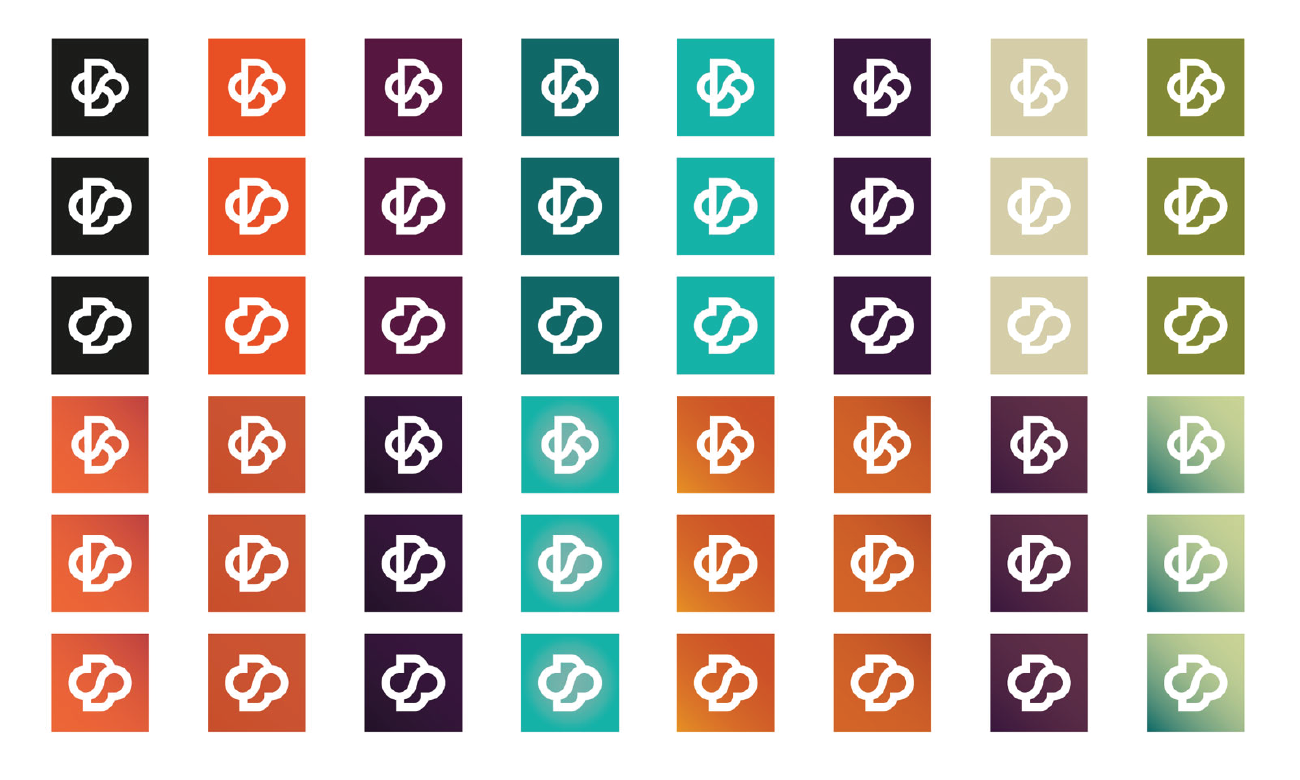

Thanks to the range of choices available and seeing them on screen and printed out, the client chose a flat, burnt orange colour. The colour orange represents; enthusiasm, fascination, happiness, creativity, determination, attraction, success, encouragement and stimulation… so it was the perfect fit for their Brand.
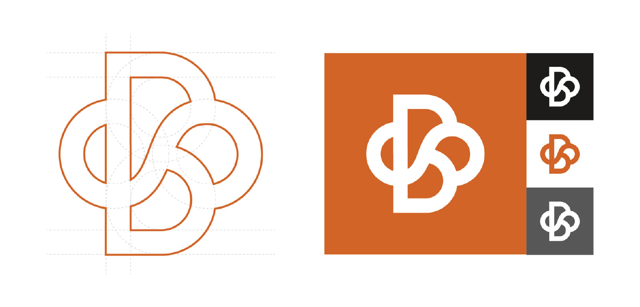
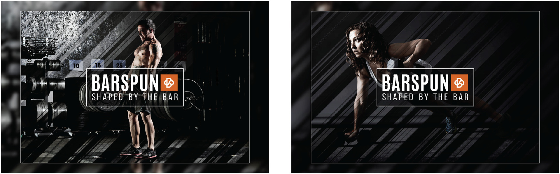
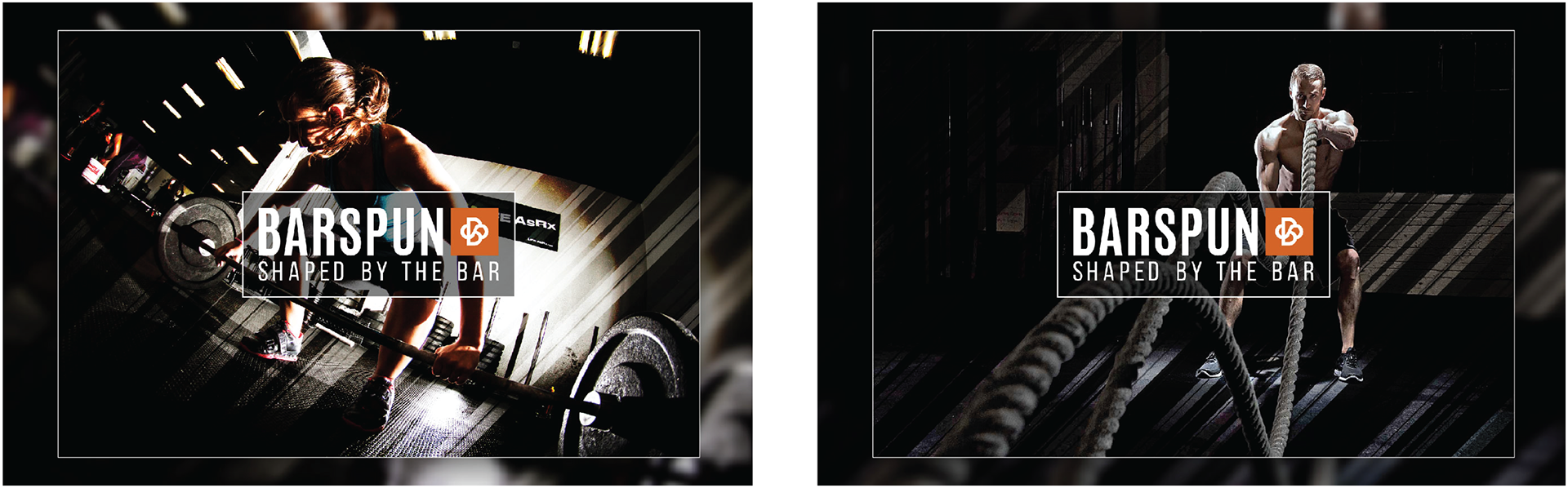
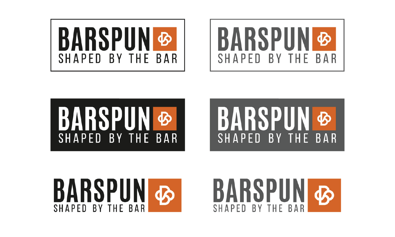
This was the finalised logo mark with the Brand colour palette. Together, we created a strong and memorable design which would work on garments, screen and print. The logo mark was then combined with the existing font and strap line to create a more developed Brand identity.
Brand development
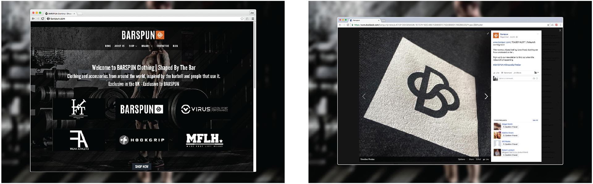
To help the client visualise how their Brand could develop, I created some mockups with related imagery. This process really helped cement the concept in their minds, and is always something I do. As the brand was still young, the imagery was designed to bring it into line with the likes of Nike and Reebok. I also created a mockup of their current website with the new logo mark.