The brief
We were briefed to create a full brand for a range of wooden nursery toys, within the space of
six months; conception through to shipment. This would be quite the challenge and would include:
six months; conception through to shipment. This would be quite the challenge and would include:
- creating a new brand
- sourcing samples
- photography & packaging (instruction manuals, outer labels, boxes etc)
- creating all assets needed for sales presentations, dotcom & social and individual retailers.

The brand
The Owl & Fox range was designed and developed to inspire confidence and independent play from an early age.
In a crowded market, the Owl & Fox range would be made primarily from Mookies’ strong relationship with the FSC, helping to promote it’s sustainability and ethical sourcing. The brand had to be designed to fit within the TP Toys brand owned by Mookie and appeal to younger and more environmentally aware consumers.
The logo & typography were designed mainly within a day... then, the colour palettes and other graphics were developed over the next month. The product design team were crucial in the overall design of the brand. While under a lot of pressure to break into this market, the most satisfying element was the teamwork.

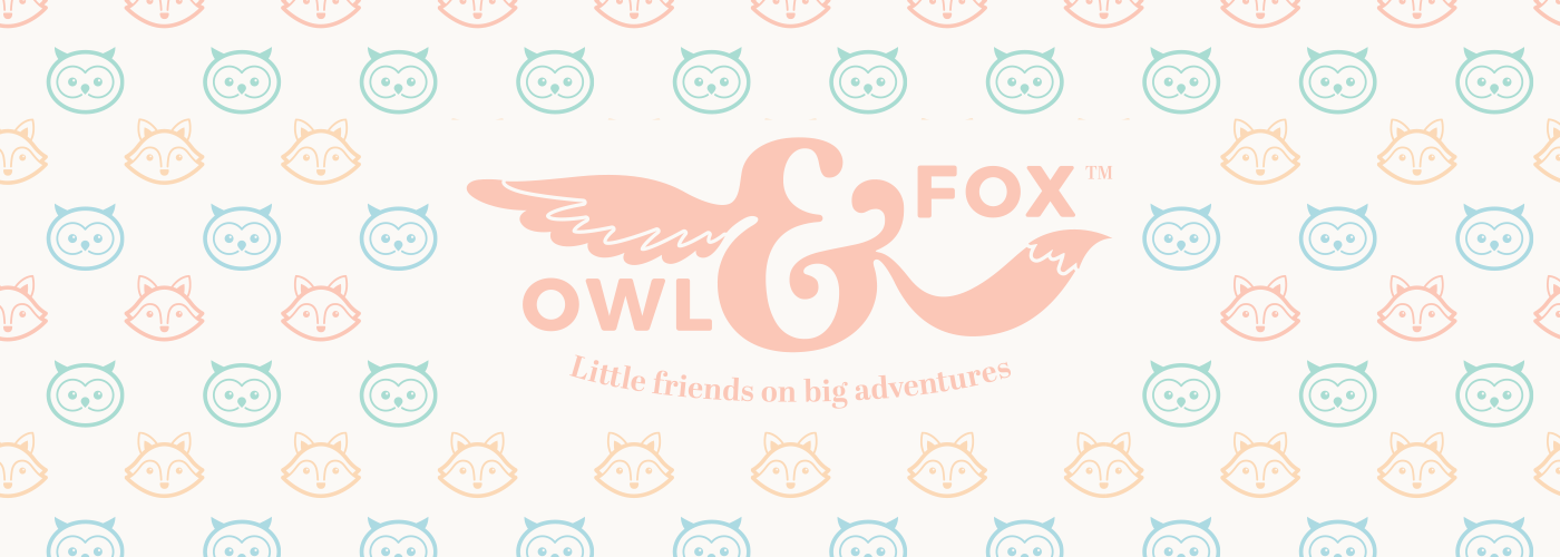
The logo mark & ampersand
After quicly sketching the initial idea, I wanted the logo to be centered around a beautiful and decorative ampersand... this would then influence the primary font. While researching, I found some ampersands that I could adapt for the logo concept.
The Owl & Fox logo was designed around the Abril fonts ampersand combined with the influenece of the other glyphs. The result was a natural and friendly graphical device. The curves were designed to be easily reproduced when branded onto wood or as a stamp on any plastics when necessary.
As Montserrat was used in the over-arching TP Toys branding, this was used as a secondary font. For the logo, the edges were slightly rounded to match the TP style. The intersecting lines within the logo mark had to be strong enough to withstand any branding or stamping without breaking up.

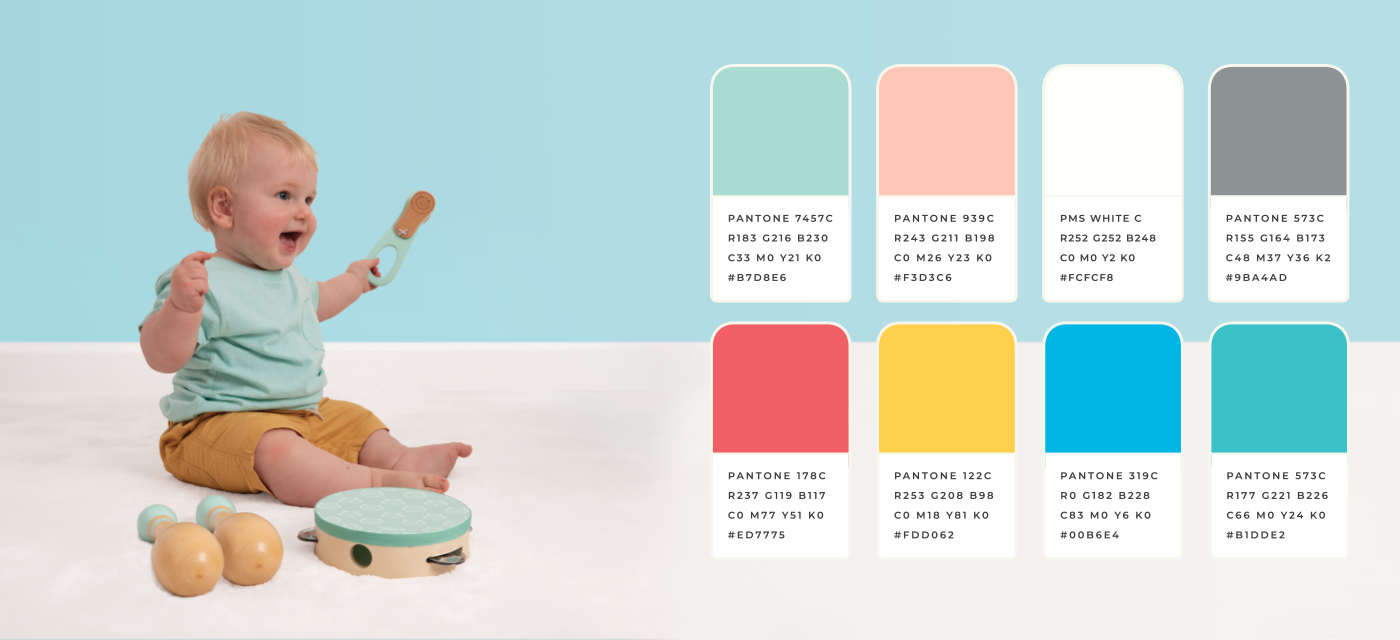
The colour palette
The colour palette was designed to be vibrant and as unisex as possible. We felt that most competitors relied on desaturated colours and we wanted Owl & Fox to stand out from the crowd.
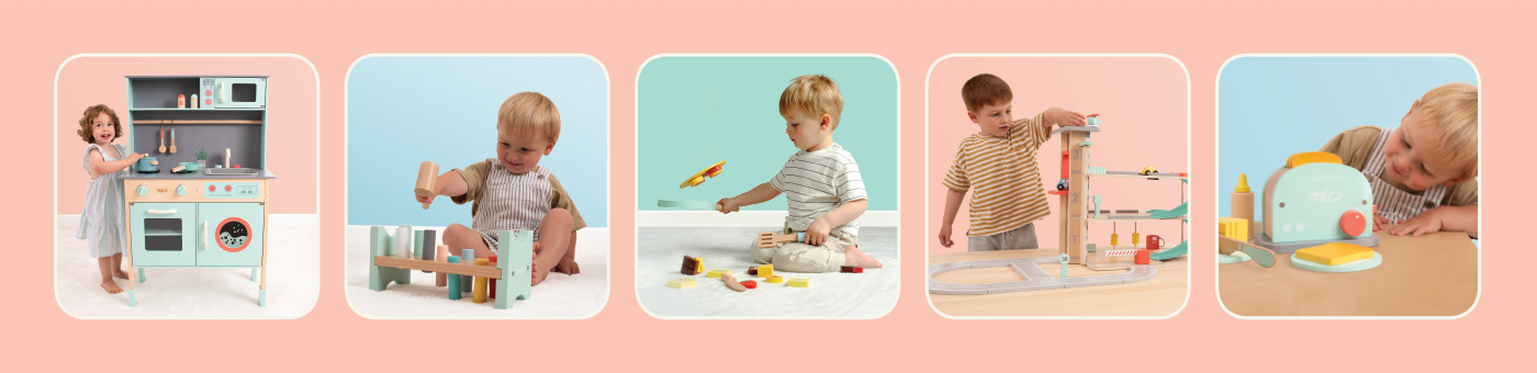
Lifestyle photography
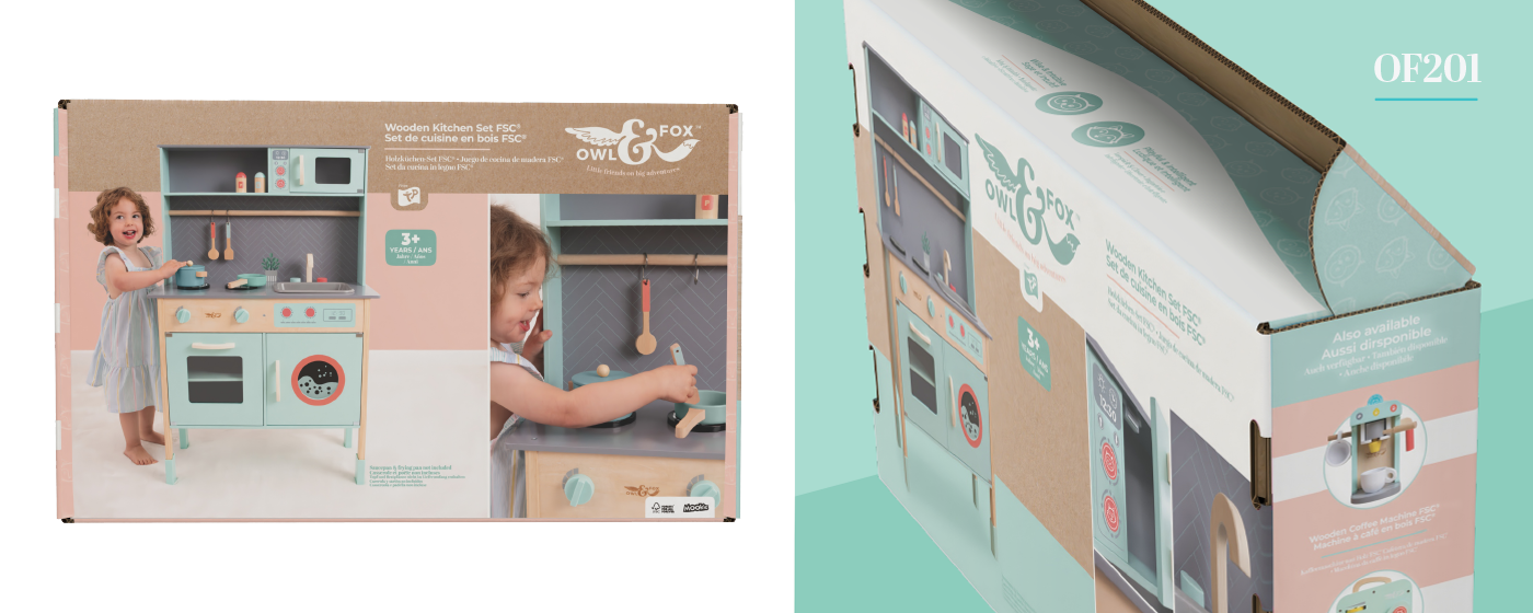
All lifestyle photography was done in a couple of days using the first samples recieved from the factories. We had yet to finalise decals and the smaller details, but we had to get all products photographed as soon as possible. This resulted in all images needing to edited to bring in the new graphics.
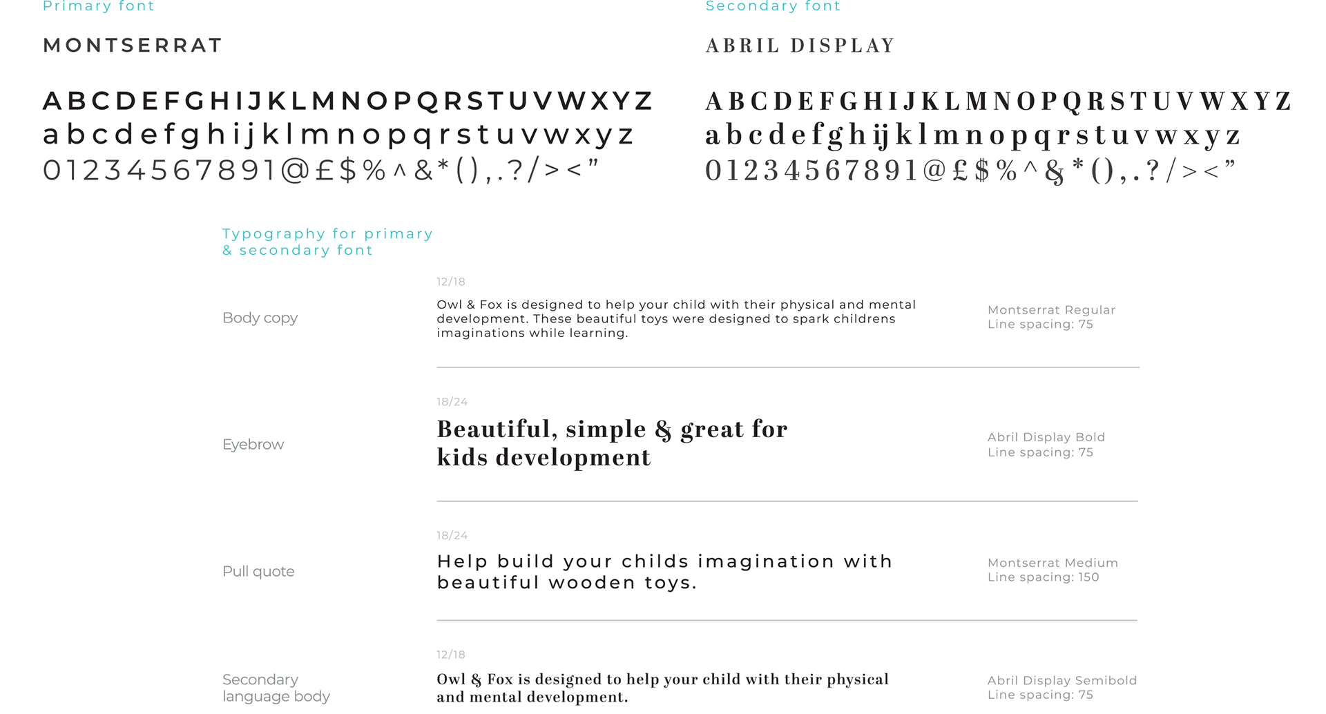
Typography
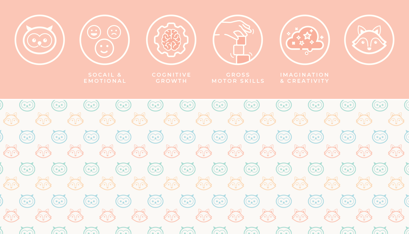
Iconography & patterns
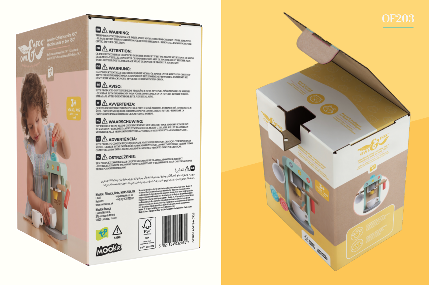
Packaging
In an extremely hectic final month, all 14 products in the range needed packaging finalised and ready for production. This involved retouching all photography with the finalised decals and design decisions, printing out and building full scale mock ups and preparing all artwork for print.
Key packaging features:
All packaging had to contain a lot of product information, multiple languages, important FSC information, the most up-to-date recycling information and product warnings in 9 languages. Each pack needed to also include spot UV treatment, product cross-sells, lifestyle and studio photography and the developmental benefits of each product.