The brief
When Mookie purchased the company Palplay, we inherited an extremely dated brand. The challenge was to completely overhaul the entire brand and packaing. We also had to develop new colour ranges for the many products so we could offer more of a choice within the range of toys.
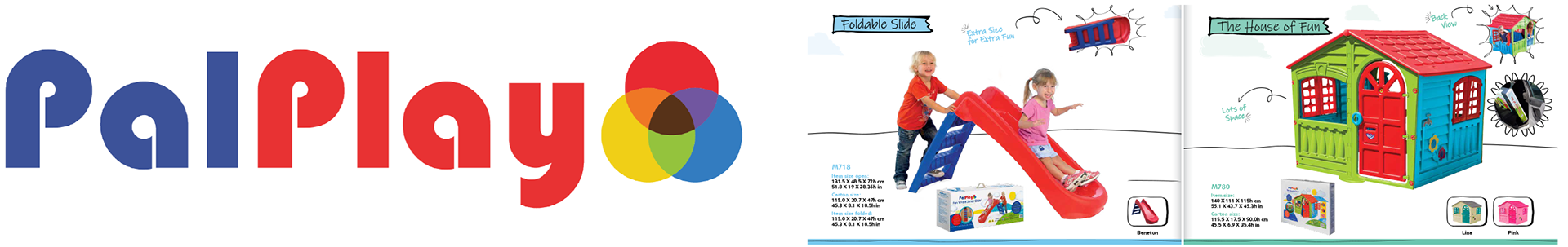
Thanks to the previous lead designer, there was already a developed logo concept, which needed developing, along with new colour palettes, typography and design language. This would include; new packaging for retailers and ecommerce, new product photography, instruction manuals and much more.
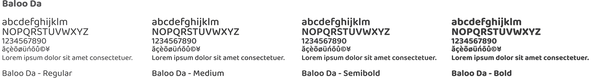
Primary Font Family - Baloo Da
Baloo was chosen for its similar properties as the Palplay logo, it feels playful, clean and versitile. A key attribute was the extensive collection of glyphs and characters used in other langauges... we had to future proof for the likelihood of moving the product range into many different territories and languages.
Secondary Font Family - Proxima Nova
Proxima Nova was used to tie into the TP Toys brand as it was used as the secondary font.


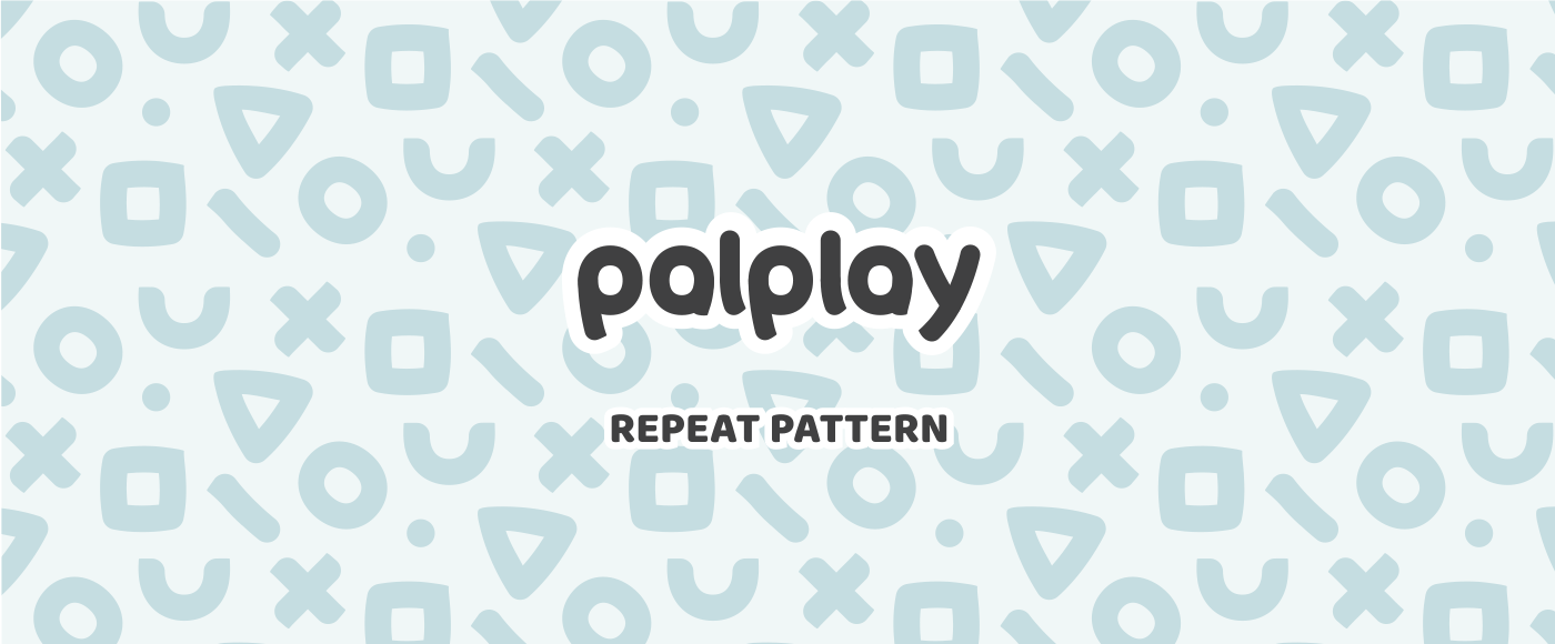
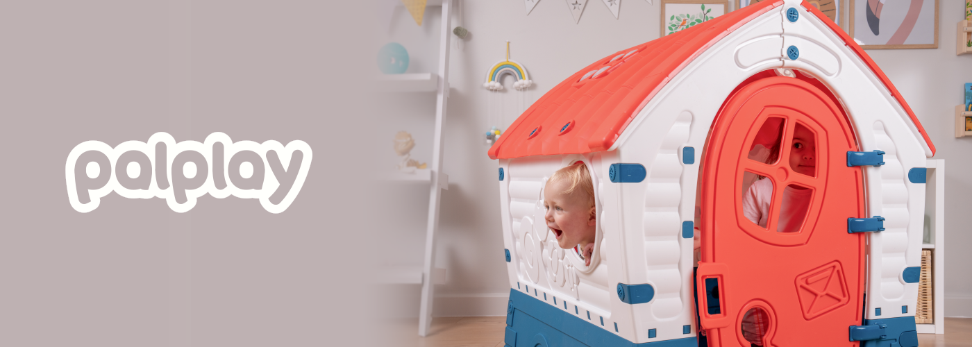
In-house product presentations
Using existing lifestyle photos from our annual August / Summer photoshoot, we recoloured the photography or used renders to pitch the new colour ways...
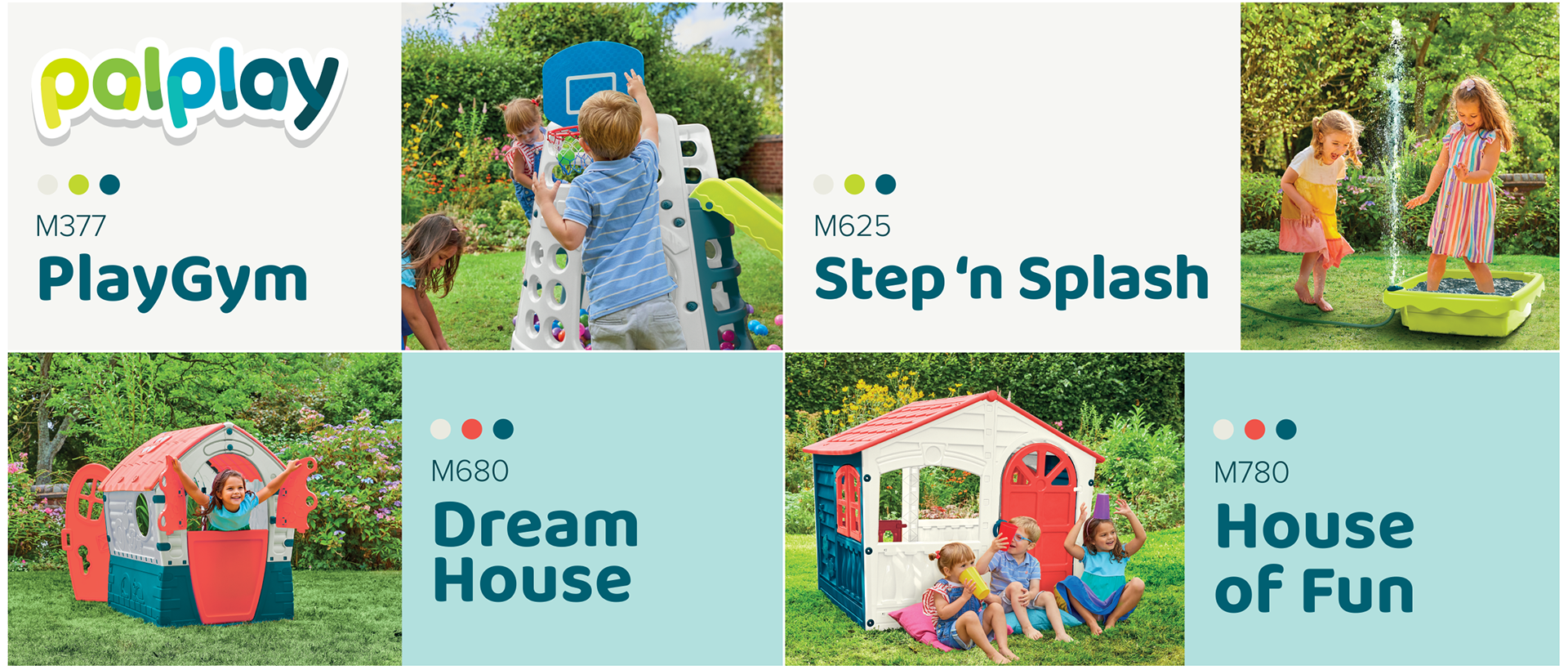
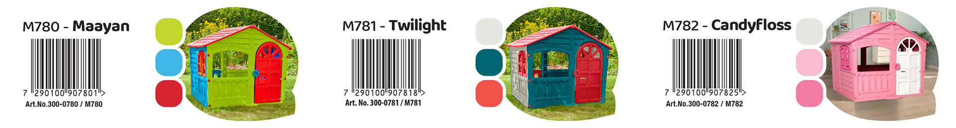
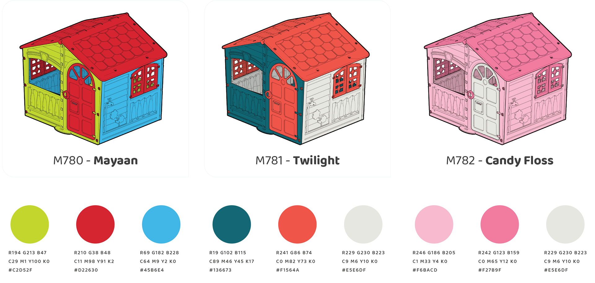
Product development
The graphics & product teams were tasked with creating new colour palettes for the product range, here are the options that were chosen:
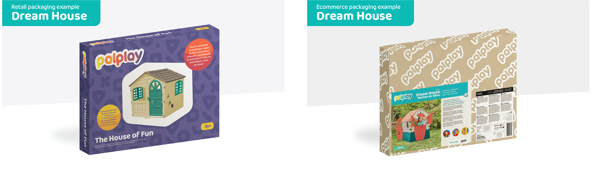
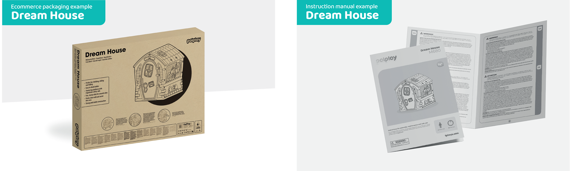
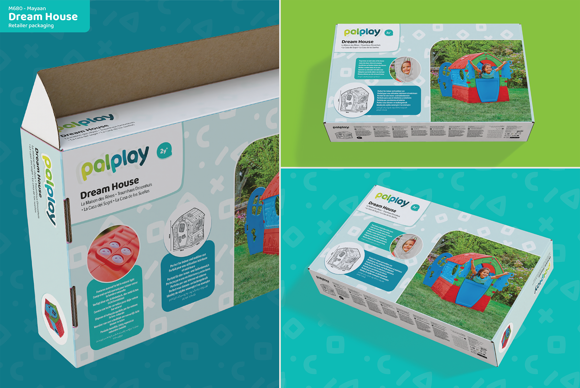
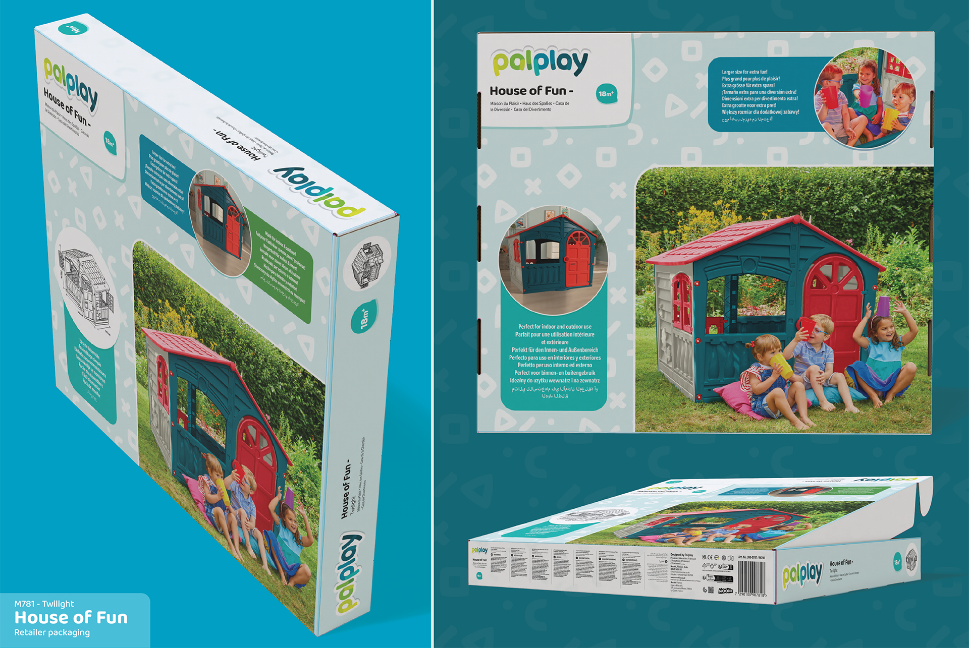
Packaging concepts
The original designs and layouts for retail and ecommerce specific packaging
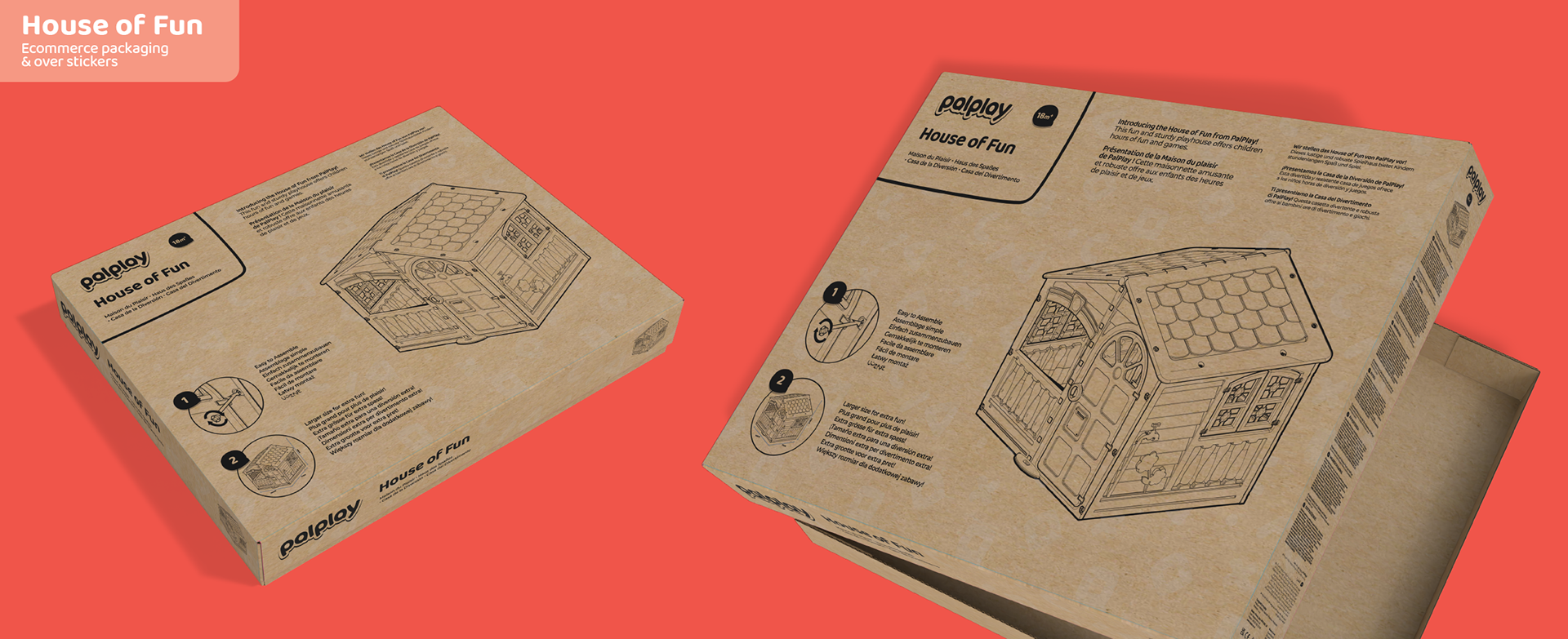
Over-stickers
To help the warehouse, logistics and customers identify the correct product, over stickers were created to go on to all ecommerce packaging. This helped keep the print costs down and give more felixibility to expand the range and colour options in the future.